14 Unique Examples of Subscription Box Packaging
They say you can’t judge a book by it’s cover, but what about a box? Is the visual element of subscription box packaging really that important? The truth is, yes, branding is a critical part of marketing for any business, especially for subscription businesses. We humans are visual creatures, after all. And for a sub-box adventure in particular, the first real-life contact your company will have with a customer is when that box arrives at their door.
Showcasing your brand on your package actually forms part of the identity of your company, as well as a part of the experience for how the customer perceives you. Indeed, the box in which your goodies will arrive to the customer is a key brand ambassador of your enterprise, so investing in custom packaging can be equally as valuable as investing in an awesome website (maybe even more). Want your ambassador to feel as bored as they would be watching the grass grow with Enya as a soundtrack? Of course, you don’t.
Now, there is a slight, but crucial difference between a boring and a minimalistic, elegant design. Just a simple, nicely done logo could differentiate your box from the majority of others and make a lasting positive impact on your customer.
Also, my subscription enterprise warrior, keep in mind that visually appealing and branded packaging is definitely an underutilized marketing method. So, when after reading this article, you apply the ideas and tricks to your own packaging, not only will that make you stand out from the crowd of competitors, but that new, distinctive look will be a powerful and lasting marketing tool.
What makes awesome subscription box packaging design – even more awesome?
The first impression matters and surely you want your brand to be remembered, noticed or at least slightly more exciting than bills or the weekly city coupon magazine. You’re into this business because, beyond the nice profit it could bring, you wish to create long lasting relationships with your subscribers and to, well, keep them in your base, so they could enjoy your products in years to come.
Unfortunately, there is no manual or wise advice from a gray-haired guru sitting on the top of the mountain to unravel the process of hacking the packing. Indeed, there’s no secret recipe to subscription boxing perfection.
But, shed no tear, because we are going to utilize the tool every successful business owner or entrepreneur uses to improve and grow. Yes, we’re going to dive into the very best examples of your sub-box competitors and learn from their practice. The next step would be for you to compare these examples to your own offering, style, branding, message, etc. and implement the similar principles (not the actual design, of course) into your packaging. Sometimes, it is enough to merely see a good solution, yell ‘Woaaah why didn’t I come up with this?’ and let it cause an avalanche of creative ideas you could use in various ways.
But, before we go further, let’s see what elements typically come together for an awesome, drool-worthy, awe-inspiring packaging design!
- It provides good marketing information – besides the logo and company name, marketing-smart package can contain the website address, maybe even a hashtag (yes, those somewhat annoying, but highly useful #’s) focused on the ongoing offer.
- It is clean, clear, creative, but comprehensible. The less is more when it comes to design, so good ones are usually (not always) laser-focused and rather simple, but appealing.
- A bit of mystery is welcome! Think of the birthday presents – would it be equally as exciting to unwrap it if the content is briefly explained? Half the fun is shaking it up and being pleasantly surprised!
- Humor does wonders, always. It’s an excellent way to entertain your subscribers, connect with them and make your brand as shareable as possible. Toss in an entertaining title or a funny logo on your package (synchronised with your products, by all means) and enjoy the reactions.
- According to Dieter Rams’ “10 principles of good design”, it shouldn’t make a product seem more innovative, powerful or valuable than it truly is – no manipulations or deceiving the customer.
So, think outside the box, don’t be afraid to experiment and let your individuality show in your package design. Because, after all, you want to stand out from the crowd, not to drown in it, right?
14 inspiring custom subscription box packaging designs
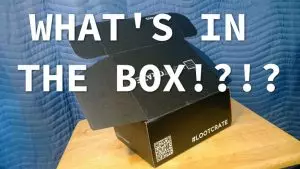
- Packaging with a social marketing boost – as a company focused on gamers, LootCrate turned the act of opening a package into a social sharing experience. Their monthly delivery is focused on a particular topic and even has hashtags and QR codes on boxes. These codes take their customers to a VIP area, where special videos are waiting for them. Also, the plain, simple black design with a clear company name is definitely a good choice.
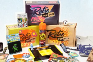
- Time travel box – it’s interesting how this Retro Pop Box brings people back in time, into a specific decade to be exact. The design plays a crucial role in the business here, providing the entire nostalgia-filled experience for a customer.
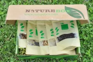
- From a first glance at NatureBox’s subscription box packaging, one can tell what their core message is – simple, natural, healthy. Aligning the company’s goal with the design is a truly smart move.
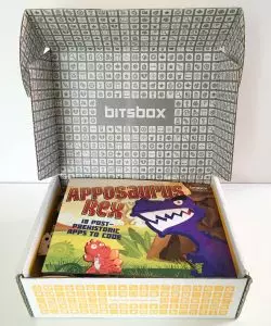
- When opening the box feels like playing a game already! Bitsbox – Coding for Kids inspires children to dive into coding and the box they’re using for subscription deliveries already does the part of the job (I’m not into games, nor coding, but this design makes me want to grab the keyboard and give it a try).
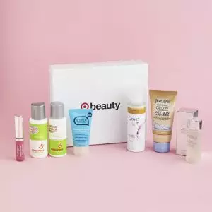
- Is it possible to achieve an effective impression with just some text on a white surface? The Target Beauty Box proves that this is possible. The symbol focuses customers’ attention on one word, “beauty”, that sums up the goal of their business. Furthermore, Target has made their brand “the target mark” so effective that you instantly know who you’re buying from. A wise move, not to mention how cheap it actually is!
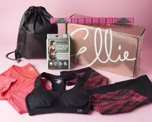
- Clearly pointing to their perfect customer, a modern woman that wants to look elegant even while she’s exercising – this shiny, elegant and simple design that Ellie uses is a great example we can learn a lot from. Also, take a look at the texture of the box, surely brings out the this-is-something-special feeling.
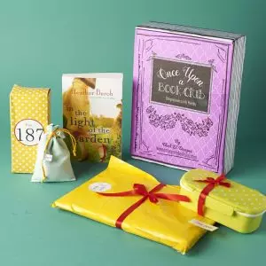
- A subscription package design for books that looks strikingly similar to a book? Yes please. Watch and learn from the Once Upon a Book Club.
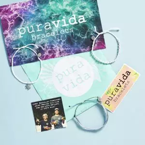
- Speaking about the experience of the package delivery, is there anyone who doesn’t love the sea, waves and nature? This charity box from Pura Vida brings the smell of the ocean into your life, it’s so refreshing and inspiring that it makes you order that bracelet, even if you don’t need one at all. (Or travel to Costa Rica to jump into the ocean yourself.)
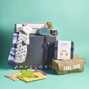
- This packaging from POPSUGAR shows how good design could be achieved with the colors and effects in letters, while the background stays plain and simple. Nice trick, not to mention that direct message to the customer – “take care” once you dive into the box, what a powerful touch!
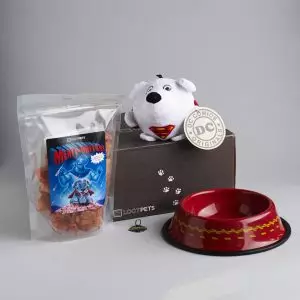
- If you didn’t know, there are geeky toys for pets. Because there is such a thing as geeky pets? Maybe, who knows. Either way, already mentioned Loot has nailed the design again – this time with Loot Pets. Once more, this black simple packaging with just a few cute paws and a clear company logo looks truly appealing and timeless.
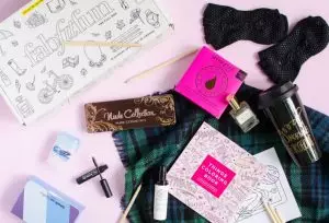
- When I say lifestyle, what are the first images that pop into your head? Gorgeous Fab Fit Fun is as playful as any mixed lifestyle package should be. Take a closer look at the details of other packaging elements, how freely creative they are, but merged with the main box design at the same time. Creativity yet cohesiveness for the win!
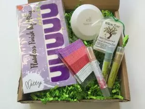
- Are those really the packaging paper strips that resemble the grass, associated with all-natural and organic beauty? Such a wise and creative touch. Also, this subscription business is focused on teens, inspiring them to turn to more natural cosmetic options, which is as altruistic as it is stylish. Watch and learn from The Better Beauty Box.
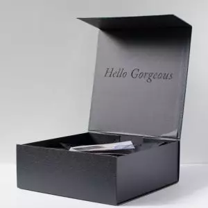
- Breathe in the elegant and powerful simplicity of this Rachel Zoe Box of Beauty packaging. Does it need anything else, apart from the direct, personal and warm greeting that makes the subscriber smile, despite all the grayness? No, their job is done here and the authority is set too – “we don’t need to prove anything” attitude shines through this purity for sure.
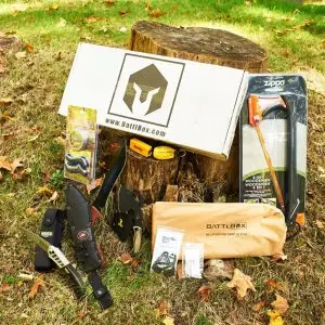
- Testosterone levels automatically rise after the first glance of this subscription packaging – BattlBox is perfect for serious adventurers and survivalists. Starting from the font, over the color choice (or the lack of color, again, the simplicity wins) and a manly, sharp logo, everything in this design shouts out – strength, solidity, sturdy survival. See you in the deep woods.
As you saw, to be both visually appealing and well-branded is a must for your subscription packaging. What have you learned from these examples? Which one did you like the most and how will you implement the ideas into your subscription business? Use the chance that design gives to rise up and stand out from the sea of competitors and profit from the marketing effect your new packaging will have.
Lastly, let us know, what is your favourite subscription packaging design and why? What makes it different and more appealing for any customer that sees it?
Signup & Try Subbly For Free
Subbly – the purpose built platform for starting and growing subscription businesses

