Why is the unboxing experience important for subscription businesses?
The first thing that often comes to mind when we think about the customer experience in the context of the whole customer journey is communication.
Of course, you need to make sure you’re staying in touch with your subscribers and growing your list through social channels, promotional, and/or transactional emails, along with other communication channels as well.
But besides this, do not underestimate the power of a knee-shaking unboxing experience for subscription boxes, which is essential from day 1, when you’re trying to acquire your first few customers.
From the first glance at your box, you’ll be presenting your company, brand, and quality. Above it all, you’re creating a connection, which began when they visited your website.
It sounds dramatic, but it’s a super important part of the experience.
The reaction customers have during the unboxing process validates whether or not your boxes look and feel good, and can also make or break your business, so make sure it’s done right.
How to create a perfect unboxing experience
Wondering how to make a good unboxing experience? Good’s not good enough! Here’s the blueprint to a perfect unboxing experience.
- The contents of your box
- Your box’s design and packaging
- Optimizing the physical unboxing experience
- Making the unboxing process feel personal
- Connecting with subscribers through CTAs (calls to action) encouraging sharing
Step 1: Deciding what goes in your box to begin with
You might remember when we spoke before about product procurement (choosing the products for your boxes) and how it shapes your customer’s experience. What matters the most here, besides the quality of your products, is the perception of value.
Meaning, when someone completes the unboxing experience, will that person feel that their investment paid off?
This part of the unpacking experience largely depends on procurement, but it doesn’t end there.
What also matters is how you arrange those products, what materials are used inside, and how professional the entire subscription box looks like.
Some of the questions you should ask yourself at this point are:
- Is the appearance of my box aligned with my offers (what customers are expecting from me)?
- Does everything look professional, clean and coherent – products, materials, colors, textures, etc.?
- Am I giving a bit more than promised (not going too far, of course, but adding something extra, no matter how small, significantly improves the overall experience)?
- Amount of products – are there too many? Or does the unnecessary empty space make the box look incomplete?
- Variety of products – maybe you promised various types of products, but offered rather similar ones? If your subscriber needs to do additional shopping after receiving the box, that’s not a good sign.
- Would I pay that exact amount for that box, if metaphorically I was the subscriber?
- Am I providing something new and exciting or keep on shipping the same old offer? Don’t bore your subscribers!
To sum it all up, the box you’re sending out should look nice and professional, full (not half-empty), complete and coherent (not like a work in progress), worth the price, and always fresh & exciting.
A small exception to the rule
There are subscription businesses that are based on elements of surprise and novelty, providing new products to their customers every month. If that’s the case with your offer, then do not use the same brand too many times.
On the other hand, some subscriptions are based on consistency, as they offer high-quality, proven-to-work products. If the second option is closer to your business, then sticking to one type of product or one brand is certainly a better choice.
Step 2: Choosing the right packaging materials to enhance your brand
If the box doesn’t look irresistible, it’s not well branded or well designed.
When the package appears at that doorstep, your subscriber should feel a strange mixture of feelings – an ecstatic urge to open up the box and a pinch of sadness because its beauty will be destroyed after the unboxing experience.
But, how can you achieve that level of package brilliance? Is it even humanly possible?
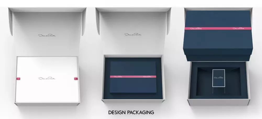
First, you need a nice design that captures the eye almost immediately.
Next, it would be great to align that design with the message and mission behind your business (aka the reasons why you’re offering the particular products, what audience needs you’re satisfying, who your audience is, etc.).
Then, consider custom packaging as an option that can fully showcase your beautiful design and meaningful branding.
Short on budget? Don’t stress.
Take a look at the various options you can use that will improve the appearance of your boxes without draining your wallet.. But first, let’s cover the core ideas.
Besides the fact that it should be beautiful, design should be merged with your branding. They should go together like a movie and popcorn.
Now, design and branding are topics that are sure to make your head spin, so let’s focus on the most important elements here.
The design of your subscription boxes should be aligned with branding in these ways:
- It is merged with the message and goal of your business, and should be directed to your target audience (whether it’s pet owners, busy entrepreneurs, nature lovers or maybe, aliens)
- It should be simple, but a bit intriguing and mysterious – on the other hand, though, it can be comical if humor is lined up with the character of your products
- A quick design-related tip – pick 2-3 colors that will be the main ones (picking less colors helps you save money on printing too)
- Keep a coherent, logical unity of elements – make sure that your logo relates to the font you’re using (primarily in style and colors) and that you’re using the same visual presentation on your website, boxes, and other branding/advertising materials.
This helps immensely when it comes to an unboxing experience. When you apply these designing and branding guidelines to your offer, your boxes will not only become more enjoyable, but they will serve as an instrument for growth.
An eye-capturing appearance is memorable. If you succeed at creating a memorable first impression (and second, and third), providing high-quality service and products over and over again – then growth comes naturally.
It’s not an easy task, but we believe in you!

Is custom packaging really needed?
Sure, there are plenty of ways to create a compelling first impression of your box without going into custom printing. The custom option takes time to plan everything out, and it also costs some money.
But, unless you’re confident that the appearance of your boxes is awesome without any custom packaging, consider making a smart investment.
The money and effort you’ll invest now in printing high-quality branded boxes aligned with your visual identity will practically sell itself and pay off in the long run, especially if your custom packaging inspires people to share their delivery with with a picture or an unboxing video on social media.
Think ahead, always think ahead in business — especially if you’re just starting out.
Step 3: Creating a fun, physically easy-to-open box
There’s something about easy-to-open packaging — whether it features a perforated strip that tears just right, inner boxes that fit together perfectly in the main container, or delicate items sealed in resealable bubble wrap envelopes — that puts a smile on your face during the unboxing experience.
It’s not just about making sure that subscribers don’t have to deal with sticky residue on their hands, though — it’s also great to create a fun experience.
Why not make a game out of the unboxing experience? Try creating some simple, fun ideas, such as deciding in what order the products should be unpacked, or having the customer assemble items in a puzzle-like manner.
On top of that, think about the textures and materials, both on the outside and inside of your subscription boxes – what kind of feelings do they evoke? Do they tickle the senses in the right way? Perhaps your products smell a bit ‘factory fresh’ when they’re new? To make your package smell good, you could maybe use a small spritz of allergen-safe perfume or a couple of dried flower petals.
Finally, think of the ways your box/product packaging can be repurposed and used by your customer, long after the unboxing experience. Bonus points if they’re aligned with you and your customers’ values, like healthy food delivery company Daily Harvest’s choice to use fully eco-friendly, biodegradable packaging.
Step 4: Making it feel personal
On how many levels and in how many interesting ways can you connect with your customers? The answer is simply – as many as your creativity can produce, and the more personal, the better.
This holds especially true during the unboxing experience, as every single part of your physical subscription box is an opportunity to communicate with the receiver.
You could start by adding a personal touch, a note or a story about you, or using the subscriber’s first name as part of the packaging, but don’t stop there!
Say thank you
When you’re starting off, a small handwritten note thanking your customer is a great way to show appreciation for your customers and reinforce that the business they’re engaging with is run by humans who care.
Once you scale, robotic handwriting solutions allow you to maintain the illusion that you’re hand-signing every package, which nobody’s going to question if you’re maintaining the same level of quality!
You could even go one step further, hiding your message somewhere in your product packaging and allowing your subscriber to find it on their own.
Include a free sample or gift
The saying ‘the best things in life are free’ rings particularly true here. Obviously, for a customer to have paid for your product and completed the checkout process to begin with, you’ll already have convinced them of your offer’s value on some level.
Slipping an extra ‘something something’ into the box is a surefire way to help you seal the deal, whether it’s free samples of something you’ll be launching soon, or a full-on free gift that’s linked to their main purchase.
To put this in context, if you offered an exotic tea subscription, for example, you could gift customers a single serving of a variety from your premium tea tier, or a branded tea strainer which they can use over the months to come.
Step 5: Encouraging customers to share their unboxing experiences
An amazing unboxing experience usually gets photographed, if not videoed.
When those unboxing videos and photos of your subscription box get on social media, you’ll achieve what every entrepreneur dreams about – free advertisement for potential customers!
Think of it this way: the very essence of every subscription business is recurrence. Every month, you have a chance to communicate and connect deeper with your customers. And the number of ways you can do that are exponential.
Inspire your subscribers to share photos of boxes with their friends, in a form of a contest perhaps.
Pro tip: Don’t forget to feature your company’s contact information on your packaging design, including social media info and different calls to action (promotions, QR codes, a link where customers can post a comment/suggestion, etc.)
A side note on unboxing videos
If you needed any more proof as to whether or not people still watched unboxing videos in 2022, note that on YouTube alone, some unboxing-specific YouTube channels have built followings of almost 20 million subscribers.
Some people might need some guidance when it comes to starting to create unboxing videos, if they want them to look professional, but in a way, a raw cut adds even more authenticity.
Given that, you don’t want to discriminate between influencer-quality cuts and amateur Instagram unboxing videos — anything positive created by customers in the public domain is a win for you when it comes to demonstrating customer loyalty.
Creative unboxing experience examples for inspiration
The world of unboxing has come a long, long way since the days of the plain brown generic cardboard box stuffed with tissue paper, and businesses of all shapes and sizes around the world have taken note. You’ve probably got quite a few ideas at this point, but we wanted to leave you with some extra inspiration.
So, without further ado, here’s a few real-life examples of brands that have really put the extra mile into their unboxing experiences, from their packaging material to their use of visual design cues.
Everly Wellness
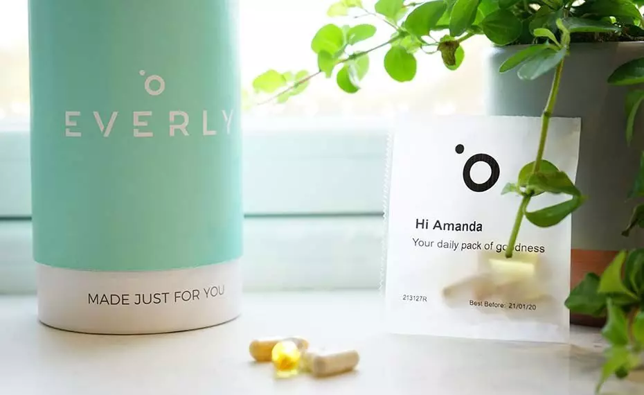
Popular wellness brand Everly Wellness delivers their vitamins to their UK subscriber base in a sleek, tubular container. Each shipment contains 28 individually-wrapped daily vitamin packs, personalized with the subscriber’s name, alongside some other information about their individualized nutrition plan. It’s a smart way of putting a personal touch on the experience and immediately building brand loyalty by capitalizing on the momentum established by the subscriber when they were completing their online consultation and building their personalized plan.
Dollar Shave Club
Everyone’s heard of the Dollar Shave Club, one of the original subscription companies that helped put the business model on the map. Since launching, they’ve revolutionized the razor industry with low prices, convenient shipping, and over time, an expanding range of high-quality skincare products. Even after their acquisition by Unilever, Dollar Shave Club’s packaging has continued to feature snarky quotes and the disruptive tone of voice their customers have always loved.
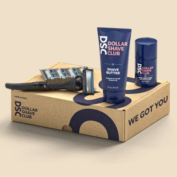
Image credit: Dollar Shave Club
The Ekiben
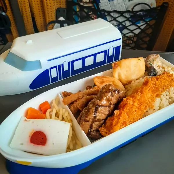
While not strictly a subscription product, Japan’s Ekiben concept is a particularly interesting example of how form and function can come together to create a highly unique unboxing experience for a well-documented product with very little standardization. Ekiben are a type of Japanese bento meal sold at train stations across the country. While the concept originated as a way to obtain an easy, relatively generic meal on the go, over time, producers started to feature more and more local food on their menus. After a while, they took it one step further, creating a memorable experience by designing containers to visually reflect the food, the trains, or the local culture of the region – turning the whole concept into an experience that’s gained hundreds of thousands of fans around the world.
Conclusion
Make sure you make the most of your customers’ unboxing moment to create a solid, long-term relationship with them. Let’s cover this one more time – here are some ways you can connect with your audience and create a memorable unboxing experience, by including these elements on or in your boxes/packages
- Top-quality, value-packed contents
- Well-designed packaging materials
- A physically easy and fun unboxing experience
- Personalized touches
- Visual cues, CTAs, and incentives to share the unboxing experience
Even if you only use some of the advice in this article, you’ll certainly elevate your unboxing experience, making your customers happy every single time they receive a shipment from you. Now go ahead and get creative — you’ve got subscribers to wow. For maximum effectiveness, consider picking an all-in-one platform like Subbly to keep everything all in one place – your first 2 weeks are on us so you can see for yourself!

